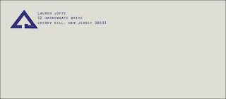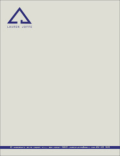


* For some reason my business card is not uploading in the correct colors. The colors I used are accurately portrayed in the envelope and stationary examples.
For my logo project, I wanted to create a logo that was simple, clean, versatile and classical. I did not want to create anything extravagant. The colors I chose are simple and neat. They are complementary of one another and do not fight for the eye's attention.
For my business cards, I decided to make the shape a square. I thought this was different and unique, which was a nice contrast to the spartan logo design I created. Overall, I really like my logo and how I used it on the card, stationary and envelope. I definitely want to get these designs professionally printed so that I can use them for internships, interviews, etc.
No comments:
Post a Comment