3 days ago
Monday, December 8, 2008
Pretty Legit
This class was pretty informative. It did completely change my perspective when i look at any sort of design/graphic whether it be on a water bottle, magazine, or poster. I gained a huge appreciation for people that work in this field. Although i probably won't apply much of what i learned in this class to my profession i am happy that i took it. The teacher and teacher's aid were very helpful and always enthusiastic which made the class more fun. The one thing i do not like about this class is that it requires students to sit in front of a computer screen for hours at a time. I hope the noticeable decrease in my visual abilities is temporary.
Sunday, December 7, 2008
Wrap Up
Graphics 217 was an extremely enjoyable class for me. I was able to learn so much in the labs and more importantly in lecture. I can definitely say that this class has opened my eyes to things that I would have never noticed beforehand. I really loved the fact that we were able to redo our projects if needed after we got them back and the critiques with classmates on the day the project was due was also really helpful. Another thing I enjoyed was being able to look at everyone else's projects on the blog. Because we are not given the opportunity in class to look at every single persons project, the blog gives us that option. Thanks for a great class!
Friday, December 5, 2008
Wrap Up
I really enjoyed this class. It was incredibly time consuming, and at time it was difficult to figure out how to work the programs, but I think the knowledge that I am taking from graphics will be super useful. It feels good to know that now I can put all of the Adobe programs on my resume, which I know will be a good thing to have. I really liked learning about all of the different aspects of a magazine, and before this class I had no idea you could kern/track/lead type. I know that I will look at things differently now because of the things I've learned.
Website Project


So I thought my website post had worked but I guess it didn't, so here it is. I decided to do the same event that I did for my poster project. It was a tea and silent auction which raised money for the Canadian Breast Cancer Foundation. I used Bodoni to evoke the fashion-y feel of the event. I put people coming out of the teacup on the first page because I thought it fit the theme and was also kind of funny. I chose to make a collage for my past events page because I thought it was a different way to display pictures than a typical photo gallery.
Week 15 - Wrap Up
I really enjoyed this class and took a lot out of it. Before this course, I had never used the Adobe programs, therefore I thought this class would be difficult and confusing. However, I surprisingly learned the programs fast (despite the lack of help from a certain lab T.A. lol). I heard that this class took a lot of commitment, and I definitely agree ... however once I started planning out my projects before going to the labs, the projects took less time to complete. I think the most important thing I learned from this class was visual perspective - I do not think I will ever look at graphics/images/etc. the same.
Wasim, thank you for all of you help, especially for the hundreds of last minute questions you answered for me the night before projects were due. You will make a great instructor.
Wasim, thank you for all of you help, especially for the hundreds of last minute questions you answered for me the night before projects were due. You will make a great instructor.
Wrap Up Post
I'd heard that graphics was a ridiculously time-consuming and barely possible course, so at the end of the semester, I'm glad to report that neither rumor was true. I really enjoyed GRA 217 and learned a lot of valuable skills. I'm sure knowing the Adobe programs will be useful in the future, as will everything we learned about layout, gestalt principles, etc. It's certainly changed the way I look at print and online media, which as a mag major, is obviously really important. In fact, after taking this course, I am actually interested in learning more about design and taking some more graphics classes in the future. ALTHOUGH, I don't know if I can handle another semester of mandatory blogging (...just kidding, Wasim).
So, in sum, I learned a lot and really enjoyed the creative aspects of the class. Thanks for a great semester!
So, in sum, I learned a lot and really enjoyed the creative aspects of the class. Thanks for a great semester!
Thank you from Wasim
I just wanted to thank everyone for posting on this blog for the semester and, for the most part, actively commenting on each others' work. I know it's been a thorn in the side sometimes, and we sometimes got off track, but I hope everyone learned a little bit from doing the assignments and sharing their projects with this peers.
Blogging will be important once you all enter the "real world" out of college. It's a great (and cheap!) self-promotional tool. What we did this semester was just the start; a way to whet your appetite for blogging.
By creating a Google account to use this blog for the class, you've already created 90 percent of what you need to start your own blog, which I hope many of you try. College is a great time to learn the ropes of blogging.
As many of you have probably figured out, I run my own blog using Blogger - something I created after taking the same graphics class (albeit the graduate-level version). You can check it out at http://wasimonline.blogspot.com/. You'll find a link there to my Web site, which was created using the same principles I learned here in the interface design project. And I already showed you all how blogging can drive traffic to your Web site. It's a synergistic relationship between the two.
Try it - you may even find it's fun! All it takes is signing in and clicking on "Dashboard" at the top and then "Create a blog" on the next page.
Thanks everyone for a great semester. You all worked really hard and I saw some great work coming from this class. It's been a pleasure to work with you in my first instructional associate job here in Syracuse.
Thursday, December 4, 2008
Well, I can't say that im going to drop everything and become a graphics major. But, on a more positive note, I am glad that I took this course. As a photo major it helped to show me how photos can intertwined with design.
I also thought learning indesign was very useful. I am sure that it will come in handy at some point down the raod. I also liked lab but I think we could have learned more from our professor about the programs if we worked with them in class too. I hope everyone has a nice winter break.
I also thought learning indesign was very useful. I am sure that it will come in handy at some point down the raod. I also liked lab but I think we could have learned more from our professor about the programs if we worked with them in class too. I hope everyone has a nice winter break.
wrap up
the labs in this class were really helpful in learning the programs. I think these programs will really help with my advertising career, and I'm glad I learned the basics on how to use them. I don't really have anything else to say about this class
Wrap Up Post
Not until now did it occur to me that it is the last day of class of fall semester 2008. I was always jealous of those who can design when I was young. Now, the feeling that I can tell others that I can design is incredible.
I shall say this is one of my favorite classes so far, and what I've learned from this class is beyond expectation. I develop my interests in design, and hope I can go somewhere with it.
We all live in a visual world, what GRA 217 has given me the most is the power to discover the beauty around me. Everything is designed, some poorly, some smoothly. But they are all equal parts of design, equal parts of a process that may generate a brilliant poster, logo, magazine, etc.
Thank you Wasim for all your help with everything, photo, graphics, career, web, and a lot others. Thank you Sherri for being a great professor who generously gave me lots of excuses to go into Starbucks to get a cup of hot coffee in the cold weather. And thanks everyone for this great class.
Good luck with the finals, and bye, GRA 217!
Wednesday, December 3, 2008
GRA Wrap Up
Overall, I thought graphics was really useful and informative. I was not very familiar with Adobe Suites until the class and now I feel really comfortable using all of the programs. I also thought that the skills we learned outside of the class were really useful to- like design principles and learning to create drafts- those are skills that we are going to utilize in most fields of communications. I thought it was nice to learn the programs with a purpose of having a project to accomplish, rather than just using them.
My favorite project was the magazine project. I liked the idea of taking an article that we were interested in and making an effective design around it. I thought it was just a really intricate project that utilized a lot of the skills that we learned throughout the semester. All of the projects were really useful, I felt. We did something that was tailored to every major taking the class- for example, magazine majors are going to be putting together magazines, and PR majors are going to be making posters.
This was just a really good class to take and I would recommend it to anyone in Newhouse, even if it is not a requirement for them. I learned so many skills that are going to be useful in the future. The only complaints I have are that it is extremely time consuming as far as the projects go, and also that we did not learn a lot in the lab until Professor Taylor had a talk with the TAs mid-semester. Other than that, the class is really enjoyable.
GRA Wrap Up
Throughout this semester, I would have to say that Graphics was probably one of my favorite classes. Although I was somewhat familiar with the softwares, it was incredibly beneficial to learn how to use them in a classroom setting. Moreover, I know the experience will help me as a I apply for internships and jobs in the future.
One of my favorite projects was the Logo Project because I felt as though I had to challenge myself to make something that was both professional and reflective of my personality. In the end, I developed a great design and picked a color pallet that I thought fulfilled not only the requirements for the class, but expectations I had for myself. I definitely want to send my design to a publisher where I can have them professionally printed. Never before had I thought about having a business card at such a young age; yet, as I moved through this project, I realized it is actually a great idea! Additionally, the stationary and envelope designs really helped me form a cohesive thought with this project. Therefore, I will probably have these professionally printed as well. I will most likely use these for internship applications and interviews as I continue throughout school.
In addition to the logo project, I found the resume project to be incredibly beneficial, as I have used this resume to apply for various internships since.
I would recommend this class to anyone who was required to take it as well as students who were permitted to take it as an elective. Even though the projects were undeniably time consuming, I think once I finished any given project, I felt a great satisfaction. I look forward to expanding my knowledge of these programs in the future, whether be taking another GRA class or exploring on my own.
Web Design
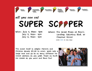
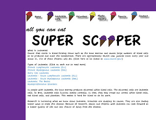
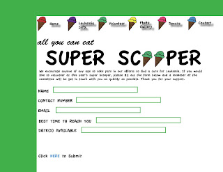

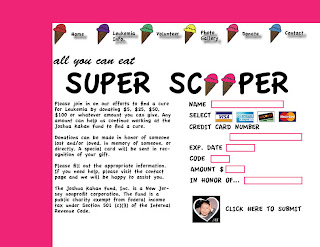
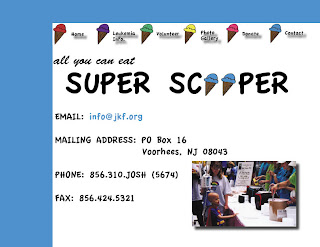
I took a floating re-do for my web design, which is why this post is late.
I decided to make a website for the Joshua Kahan Foundation's annual Super Scooper event. It is an all-you-can-eat ice cream event in Philadelphia that raises money for Leukemia. I decided to use a lot of color in the design, mainly to attract the eye as well as a quirky font. Because the event essentially revolves around ice cream, I used a lot of ice cream cone visuals throughout the page, whether is be in the horizontal container, tag line, etc. I made six pages: Home, Leukemia Info, Volunteer, Photo Gallery, Donate and Contact Us. I think this was a sufficient amount of links, as it includes information about the event, the disease, prior events and how to get involved.
Wrap Up GRA 217
I really enjoyed this course because it was so new to me. Before this class I really hadn't done specific projects that are useful for right now and in the future. My resume had been done in such a plain way and this class taught me to focus more on the smaller details because they make such a difference against stacks of other resumes. The logo was so much fun to design and put to use on letterheads and business cards. My favorite, yet most challenging, project was the magazine especially because I am a magazine major. Before this class, I had never realized that magazine majors dealt so closely with the design and graphics of a magazine. I only have experience with writing for magazines so this opened up a huge door for me to explore and learn about making a magazine from start to finish. The website was fun to design as I pictured what an easy website looked like, simple and organized. I entered this class with no experience of the programs that we use, and now I am very familiar with many of them. I can truly say that InDesign is a program that really has endless options and I learn more everyday with it. I learned a lot from this course and for one thing, I will never look at color and typefaces in the same way.
Tuesday, December 2, 2008
Final Wrap Up
I really did enjoy this class. I feel like it is really rare that people can say that about a course, but this one was great. Even though the projects were time consuming and it took some time to get used to the programs, I never minded it. I love playing around with design and it was even better that I got to do it for a grade. I will 100% walk away from this class with something. I have already been using indesign to create things outside of class and will continue to do so.
Website


For my webpage I based it off of my poster. The headline being "where the kids create the dream" inspired my design to appear as if a child had made the webpage. I wanted to do this so kids would be captured by it because they could relate to it and the colors would be very appealing. I also wanted it to spark an emotional response in the parents so that when they saw it they would feel as if it were a piece of art that their child had made. I used the same and similar visuals from my poster to tie the two together.
Interface Design


 My interface design was for the 25th Anniversary celebration/fundraising drive of Vive La Casa, a refugee shelter in Buffalo. The pages are an irregular shape to represent the idea of a scrolling page... only the burgundy box would scroll. My fonts are Garamond and Verdana, and the vast majority of the images were taken from a Buffalo News soundslide about the shelter.
These are just the first three pages, as the last two are apparently "corrupted"... but they're pretty similar, and in the same format.
Monday, December 1, 2008
interface design


I did the Trinity Turkey Trot which was my poster project as well. I wanted the website to be easily navigable, so I bolded subheads to create visual hierarchy. I chose a palate of warm colors to reflect the holiday and season, and used my turkey from the poster project as part of the header because it was well received by my church.
Interface Design


The organization is Syracuse Grows, a non-for-profit organization that advocates city gardening. So I chose the colors dirt brown and green. The design is inspired by a image that I found on google. I enlarged the image, and used part of it as the background image.
I used Georgia as the typeface, and had a little fun with the logo.
Subscribe to:
Posts (Atom)


